
Dataset source: https://www.kaggle.com/fernandol/countries-of-the-world/downloads/countries-of-the-world.zip/1
The data is visualized with the help of Tabeleau.
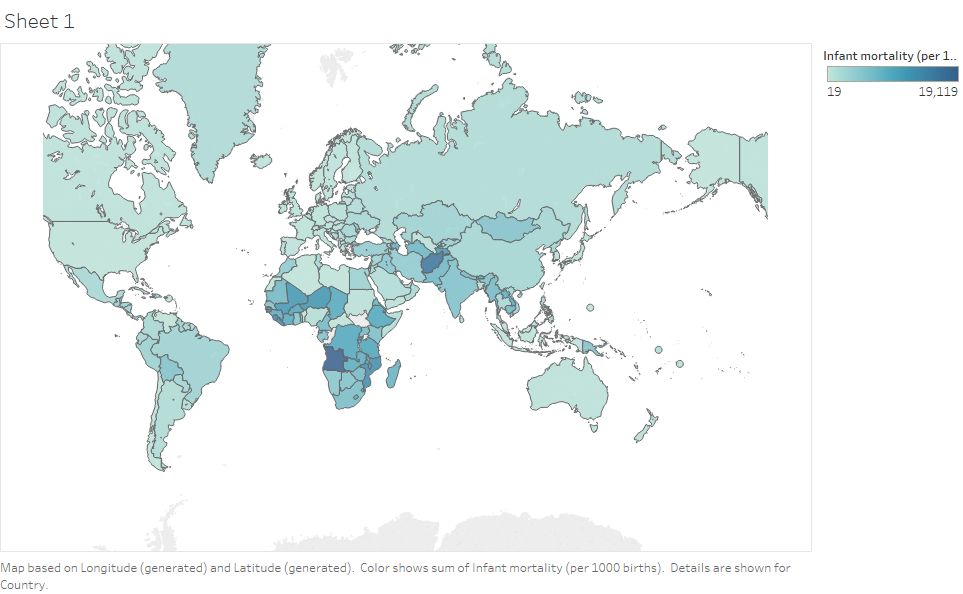
Infant mortality rate (per 1000 births) of countries
The darker blue region represents higher number of infant mortality.
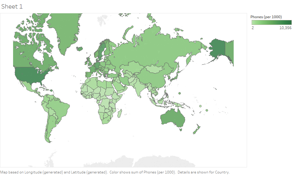
World mobile phone usage (per 1000 people)
The darker green region represents greater number of mobile phone usage.
GDP ($ per capita)

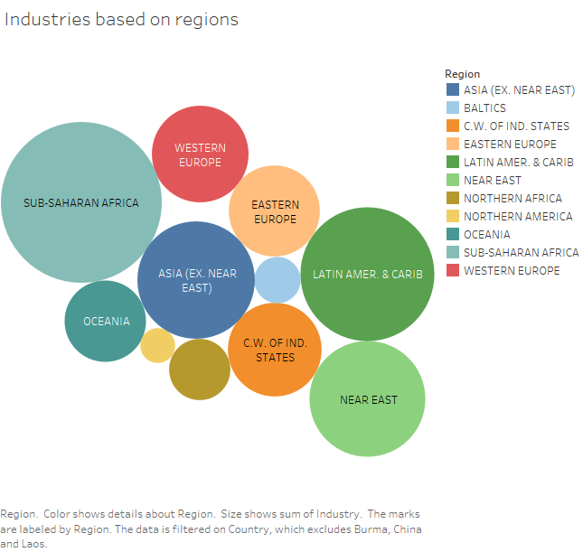
Industries based on regions
The bigger the circle, the greater the number of industries.
Contact : sulovekoirala@gmail.com
